Battelle Publishes Open Source Binary Visualization Tool
Battelle has evolved its binary visualization tool CantorDust (originally presented as ..cantor.dust.. in 2012) into a plugin for the open source Ghidra disassembler. Our team is releasing this tool, open source, on our GitHub page.
CantorDust enables the rapid visualization of unknown binary data, reducing the burden on digital forensics and reverse engineering teams. We hope the community finds the tool as useful as we have and will evaluate pull requests and feature proposals.
Binary Visualization with CantorDust
Humans are pretty terrible at making sense of a massive string of 1’s and 0’s, but humans are great at finding patterns in images. This was the idea that created CantorDust We wanted to find a way to represent binary data in a way a human can easily understand and reason about dynamically.
Computers think in 1’s and 0’s. Everything on your computer or smartphone is ultimately expressed in this binary data, whether it’s a picture of your dog, the audio file of your favorite song, a text message from your sister, the source code for an app or operating system, or the firmware for the device itself. At the binary level, all of these elements are expressed as strings of 1’s and 0’s that can be thousands, millions or billions of digits long. The human brain has a terrible time making sense of all that data—or even telling the difference between an audio file and a snippet of machine code.
However, the human brain is very good at processing images. Our visual processing centers are capable of interpreting highly complex visual data—the equivalent of millions of 1’s and 0’s—almost instantaneously. CantorDust allows cybersecurity researchers and reverse engineers to tap into this ability by turning strings of 1’s and 0’s into visual representations. This allows them to determine in seconds what kind of data they are looking at and start making sense of it. CantorDust has the potential to vastly reduce the time requirements for analyzing unknown binary code. The tool is already being used in the cybersecurity realm. Now, Battelle is making it available as plugin for the open source Ghidra disassembler.
Why Binary Data Visualization Is Useful
CantorDust is a powerful tool for the cybersecurity, digital forensics and reverse engineering communities. For example, it could help security researchers rapidly analyze unknown binary code to identify and reverse engineer malware or used for vulnerability discovery for Internet of Things (IoT) devices.
Digital Forensic Analysts and Reverse Engineers have a large number of tools available to them when analyzing binary data, but for the most part these tools fall into two broad categories: tools that show the raw data with little thought into actually trying to interpret what anything means (think hexdump or hex editors), and tools that try to interpret the data following strict rules with fairly rigid definitions. There are some serious problems with bridging the gap between these two ideas, and that is something we think CantorDust can help address.
For example, disassemblers such as the Ghidra code analyzer can analyze code in hexadecimal format and organize it so reverse engineers can understand what kinds of commands each string of numbers may correlate to. However, this assumes that we already know that the raw data represents some kind of code and not, say, a picture of a cat. If we don’t already have a good idea of what kind of data we are trying to analyze, we can waste a lot of time running it through the wrong kinds of tools.

Data Visualization with Digraphs
One technique CantorDust uses to visualize data is digraphs. Digraphs were presented by Greg Conti during his Blackhat talk in 2010. This is the idea that sequential bytes have an implicit relationship. He presented a visualization technique he called digraphs, where he would take sequential byte pairs and map them on a cartesian graph. Here is a quick example of his idea in action:

The word “battelle” is broken down into digraphs (2-letter strings) to analyze the relationships between sequential bytes (left). Each byte is expressed in hexadecimal format and the 2-byte strings are then mapped onto a cartesian graph. Each dot represents one 2-byte string, with the first byte mapped along the X-axis and the second byte mapped along the Y-axis (right).
It turns out, mapping data this way reveals some awesome patterns that are visually unique and easy to identify. Different types of data (such as audio files, photographs, bitmaps, video, written human language or machine code) produce different kinds of visual patterns. Once we learn to recognize these patterns, they can tell us at a glance what kind of data we have.
Here are some quick examples of using CantorDust to visualize different file types:

.wav audio file

Bitmap

Normal ASCII text
Let’s dive into the ASCII text example in a bit more detail. There are clearly some pretty distinct patterns here. The block of data in the lower right-hand corner are produced as a result of plotting lowercase letters followed by lowercase letters. The block above that is the result of uppercase letters followed by lowercase letters. The vertical and horizontal lines are indications of other characters like new lines, spaces and periods. All of these patterns make sense if the data is well-formatted English text following a conventional grammar.
Let’s take a look at an unknown binary file and see what we might be able to figure out with our new knowledge (zoomed in on the region of interest):

Unknown binary file as visualized by CantorDust
We can still see many of the patterns we saw in the normal English text version but there are some additions here. We already know that an example of normal ASCII text results in two distinct block structures along with a couple vertical and horizontal lines. Here we can clearly see four distinct block structures. These structures do not appear in our first visualization because those patterns are not common to normal ASCII text. What other encodings might reveal these four distinct patterns?
Let’s map out what we know:
- This data looks similar to our Lorem Ipsum ASCII text example.
- There are additional block structures compared to the example we saw previously.
- The two original block structures were a result of the patterns of bytes present in normal ASCII text:
- Uppercase characters followed by lowercase characters like at the start of a sentence or for proper nouns etc.
- Lowercase characters followed by lowercase characters like the bulk of text in a normal English sentence.
Our knowledge can lead us to a couple conclusions.
First, the similar patterns we are seeing and the similar location on our plot indicates we are looking at a similar set of bytes, but there are additional patterns that are appearing that we are unfamiliar with. Another assumption we might make based on our previous knowledge is that the two additional block structures present here would represent the two enumerations of upper- and lowercase characters that rarely appear in our normal English text: uppercase characters followed by uppercase characters, and lowercase characters followed by uppercase characters.
So, we are looking at a similar set of characters (alpha-numeric ASCII), but organized in such a way that there are occurrences of upper-upper, upper-lower, lower-upper and lower-lower character pairings. This might mean we are looking at a new grammar or possibly an encoding that contains all alpha-numeric characters. As it turns out, this plot represents Base64 encoded data. Base64 is an encoding that contains all alpha-numeric characters, and also has no rules or grammar that prevent the character pairings seen in this plot.
How quickly were you able to pick out the block patterns? Could you make any inferences on the data just by looking at it? Sure, most reverse engineers can very quickly look at data in a hex editor and determine if something is English text or Base64 encoded data, but hopefully you can see even with this basic example that picking out patterns visually can be an extremely powerful tool.
ASCII data is one cool example we can use this tool on, but what else can we look at?
Let’s take a look at some machine code.

Armv5I

Armv7m

X86_64

S390x
The biggest feature we can see across these code samples is that they all have fairly distinct vertical and horizontal lines. As it turns out, this is a pattern that can be found in most examples of machine code we have examined. The exact placement of these lines is dependent on the specific architecture, but that is a very distinctive pattern we can look for when trying to identify an unknown binary blob.
As you can hopefully see by this point, different types of data have very unique patterns that we can learn to recognize very easily.
Data Visualization with Hilbert Mappings
Another visualization technique utilized by CantorDust is the Hilbert curve mapping, originally presented by Aldo Cortesi on his blog corte.si. The Hilbert Curve is a continuous fractal space-filling curve. It is used to map a 1D string of data into an alternate dimensional space. This technique displays data in a concise way while preserving the locality of the data.

This technique is great for presenting data in an easier-to-understand format. A quick example:
Here we see a file laid out in a linear format, and the same file translated to a Hilbert Curve. You can see structures emerge from this mapping. This is another great way to visualize data dynamically.


Data visualized in a linear format (left) and using Hilbert Curve mapping (right). Image source.
This view really helps small regions of interest pop out rather than be overlooked. This is a really brief overview of this feature, and we may try to dive a little deeper into how we utilize this feature in a future blogpost, but for now play around with the view and let us know how you use it.
Using CantorDust for Binary Data Visualization
CantorDust is a Ghidra plugin. Please follow the Ghidra users guide for downloading and installing Ghidra.
CantorDust simply needs to be added to your Ghidra script folder to run. Load up your binary into Ghidra, load the CantorDust plugin and have fun exploring your file.
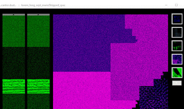
 This is the view you see when launching CantorDust.
In the image above, the two sliding windows on the left-hand side are macro and micro region selectors, so users can quickly navigate around the binary file and examine regions of interest. Visualizations will only be generated for the currently selected region. The main window displays the currently selected visualization technique. Clicking anywhere in this window will jump the Ghidra code analyzer window to that address in the file.

The buttons along the right-hand side allow users to open up different visualization windows. (Shift-clicking changes the visualization in the main window).
CantorDust in action! Here we can see an intrepid reverse engineer begin to analyze a binary blob of data. While scanning through the data, they identify a pattern that looks like it might indicate a bitmap image. They switch to the bitmap visualizer built into CantorDust and play around with the color scheme. Sure enough, an image begins to appear…

How to Get CantorDust
CantorDust is hosted on Battelle’s GitHub page. Clone or download the CantorDust repo.
Next, download and install Ghidra 9.1+ to your machine (CantorDust requires Ghidra 9.1 or higher).
Now, create a new project in Ghidra and add the CantorDust directory to your Ghidra Script manager. This can be done by opening the script manager (green play button), opening up the script directories screen and hitting the green “+” button.
Why Now?
CantorDust (then ..cantor.dust..) was first presented at various conferences in 2012. During the initial development period, some design decisions were made that we wanted to correct before a code drop, which slowed down development and, as is the result in many development projects, other priorities took precedence. The recent release of Ghidra prompted us to revisit a lot of the tools we had developed over the years, looking for things we could integrate into Ghidra plugins. We brought CantorDust back to the front burner and finalized a streamlined version with the functions and visualizations that have proved to be most useful to our reverse engineers.
The current suite of visualization techniques represents the subset of features that have actually proven to be useful over the last decade of use at Battelle. What we are releasing here we hope will be just the beginning—a foundation to build upon. We would like to encourage the community to take this tool and run with it! Please use it to solve those Stego CTF problems, add in your own views, and try to visualize data in new and exciting ways. We will be eagerly looking for pull requests to make this tool even better.
Special Thanks
CantorDust (then ..cantor.dust..) was originally created by Chris Domas (@xoreaxeaxeax), with funding from Battelle. The Ghidra plugin version of CantorDust was primarily developed by Battelle interns AJ Snedden and Mike Senglemann with funding from Battelle.
Related Blogs


Delivering tomorrow’s solutions, today. Advancing technology for our warfighters and the future of RF.
Read More


BATTELLE UPDATES
Receive updates from Battelle for an all-access pass to the incredible work of Battelle researchers.